Another month of books, another month of book covers. Maybe it’s all the orange and black assaulting my vision when I step out the door, but this month, I’ve been responding to simplicity and elegance—and, as always, humor. Can never have too much of that. Here are my favorite book covers of October.
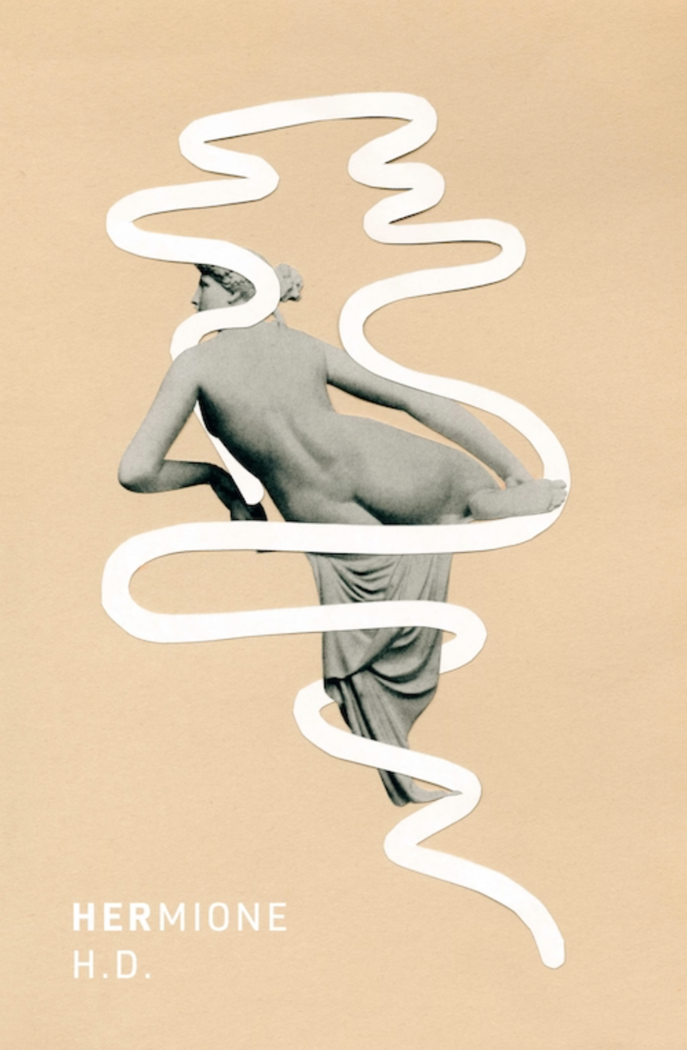 H.D., HERmione; cover design by Rodrigo Corral (New Directions, October 4)
This would be gorgeous even without the subtle dimensionality, which elevates it even further.
 Hiroko Oyamada, Weasels in the Attic; cover design by Janet Hansen (New Directions, October 4)
All of Hansen’s covers for Oyamada’s books have been weird and bold and colorful; this one has the added value of being funny, too.
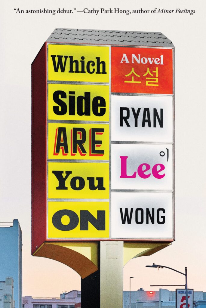 Ryan Lee Wong, Which Side Are You On; cover design by Gregg Kulick (Catapult, October 4)
A clever and convincing—and fun—take on the signage-style cover.
 Orhan Pamuk, Nights of Plague; cover design by Chip Kidd (Knopf, October 4)
The encroaching dark here is both simple and brilliant.
 Joe Vallese (ed.), It Came from the Closet; cover design by Bráulio Amado (Feminist Press, October 4)
Very funny, and visually striking to boot.
 Maya Phillips, Nerd; cover design by James Iacobelli (Atria, October 11)
I love this version of the all-type cover, which invites you to recognize (or guess) at all the typographical references—which in turn invites you right into the book.
 Peter Brooks, Seduced by Story; cover design by Katy Homans, cover image: Jean Auguste Dominique Ingres, Paolo and Francesca, 1814 (NYRB, October 18)
I love the simple style of the new NYRB series; that this one makes use of a saucy (and dramatic!) painting makes it all the better.
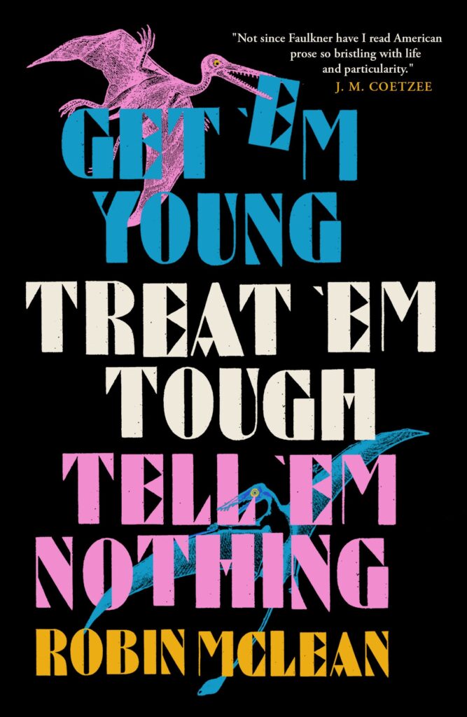 Robin McLean, Get ’em Young, Treat ’em Tough, Tell ’em Nothing; cover design by Anna Morrison (And Other Stories, October 18)
The pterodactyl making off with the E! Come on.
 John Banville, The Singularities; cover design by John Gall (Knopf, October 25)
Classic John Gall, and exactly the kind of cover that makes me want to pick up a book.
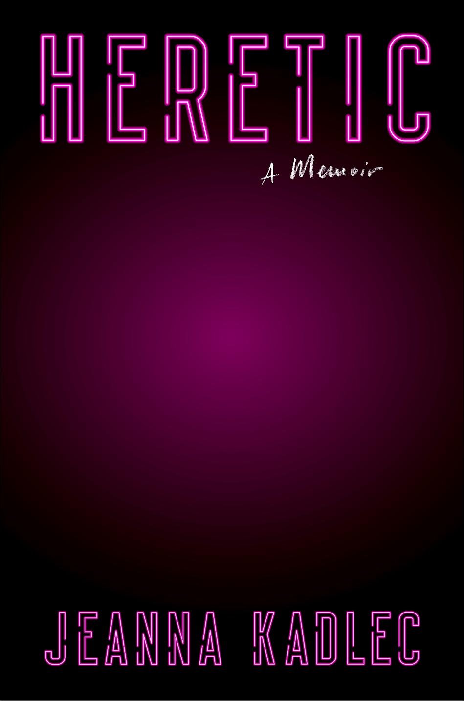 Jeanna Kadlec, Heretic; cover design by Robin Bilardello (Harper, October 25)
Another simple but effective cover, which builds a lot of mystery in all that hazy middle space.
