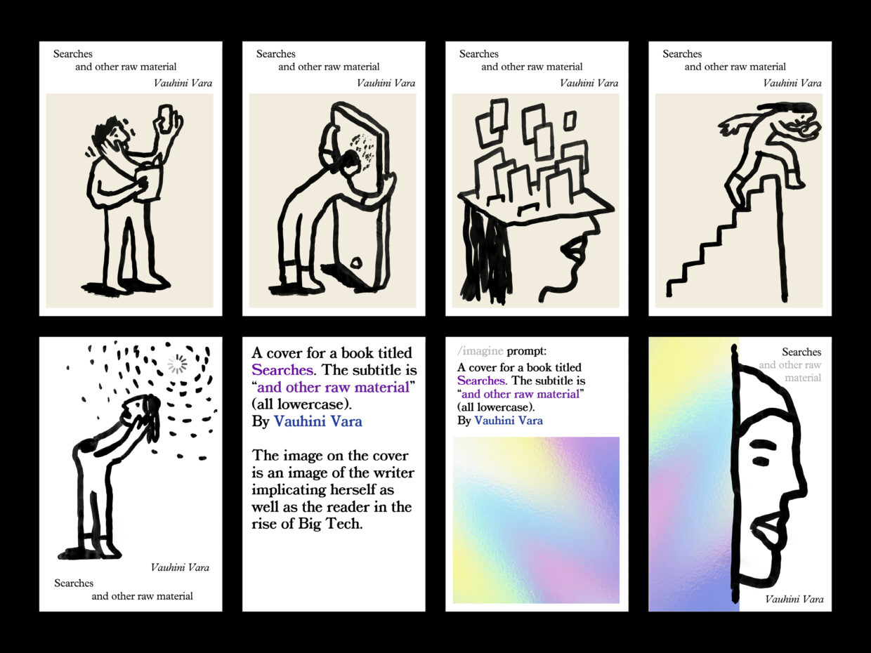
Searches, as our publisher first described to me, explores the nature of artificial intelligence and our complicity with technological capitalism. Through a blend of memoir and cultural criticism, the author Vauhini Vara uses the tools of Big Tech (namely ChatGPT) to critique Big Tech itself, while revealing her own deeply personal digital footprints.
Article continues after advertisement
As the art director of Pantheon Books, I see my job as a collaboration, commissioning designers and illustrators whose unique perspectives befit each title.
I knew this book would demand an unconventional approach. In an early email, Vauhini shared her reluctance about going in an overly “internetty” direction.
It feels to me like there’s a thing in the book zeitgeist where, when a book is meant to be about the internet, the cover itself takes on a kind of internetty aesthetic, with Apple-like sans-serif typeface, computer-y iconography, Instagram-friendly imagery, and so on. And because the book is in part a critique of the totalizing aesthetic of Big Tech, I’d be really interested in any cover ideas that very consciously push back against that aesthetic.
–Vauhini Vara
*
I was excited to take a more subversive approach, and thought of Pablo Delcan, an artist whose recent work approaches AI in a subversive way. In his project, Prompt Brush, Pablo invites visitors to submit text prompts that he then illustrates using a brush and black ink on paper—what he describes as the “first non-A.I. generative art model.”
Despite the book’s techy themes, there was a piercing humanity at the core of each essay.
In an early meeting, after the editor suggested soliciting prompts from the author and using AI to create the cover art, I referenced Pablo’s work and proposed that he respond as well. Vauhini was on board. She wrote nine prompts, from which I chose three that spoke to the book’s content.
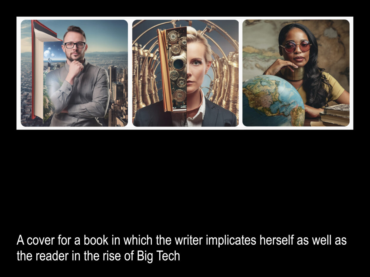
—A cover for a book in which the writer implicates herself as well as the reader in the rise of Big Tech
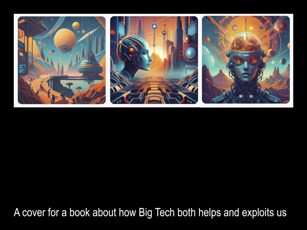
—A cover for a book about how Big Tech both helps and exploits us
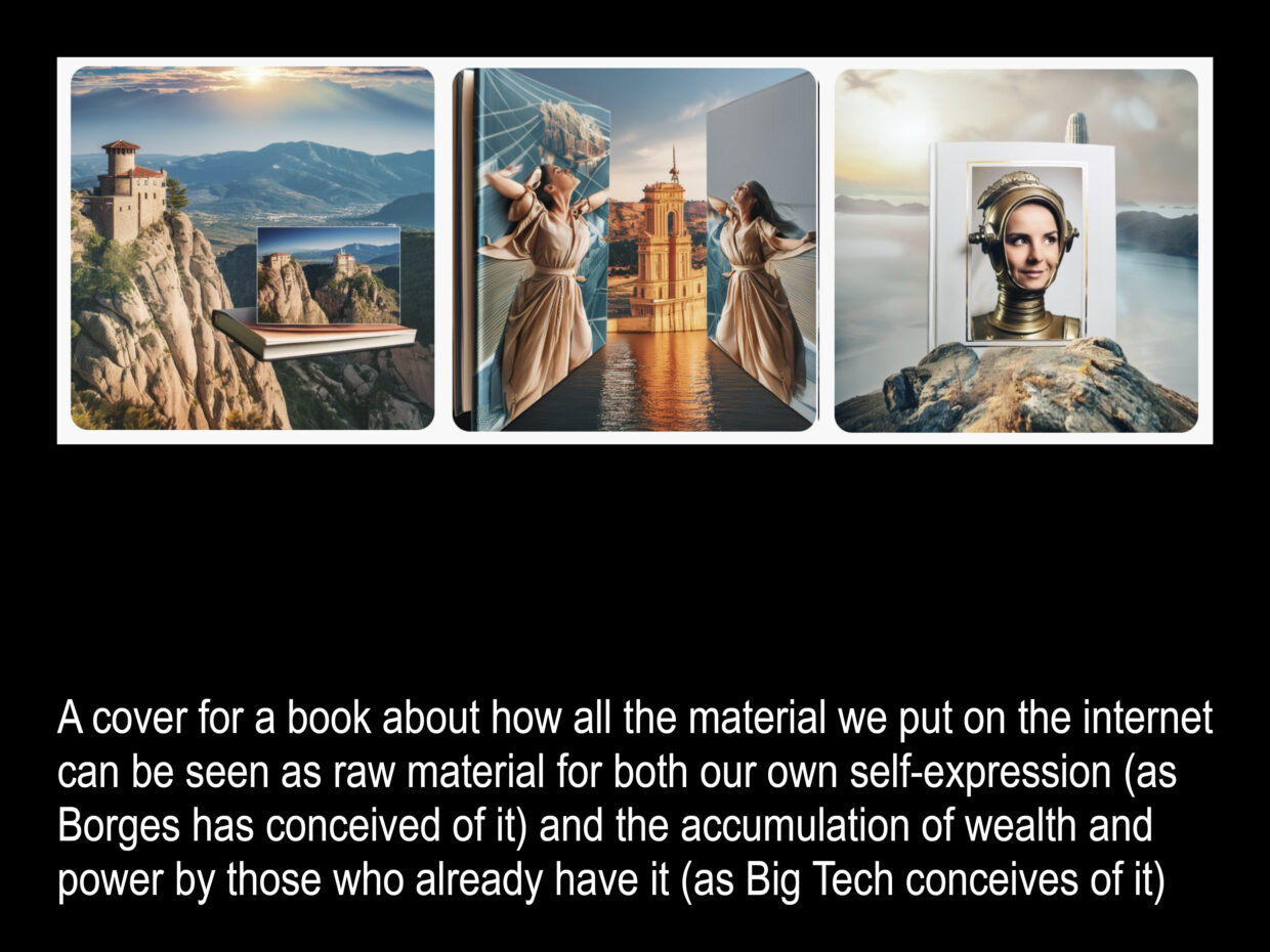
—A cover for a book about how all the material we put on the internet can be seen as raw material for both our own self-expression (as Borges has conceived of it) and the accumulation of wealth and power by those who already have it (as Big Tech conceives of it)
–Vauhini Vara
Pablo responded with a series of covers: most depicting people enmeshed with technology and others using only typography. (Note: we were originally working with a different subtitle.)
Vauhini had also proposed visually pairing Pablo’s images with those generated by a machine.
[T]here’s a section in the manuscript where the very first human art, as well as 17th-century art purchased by the merchant class, are positioned as being important antecedents to both art and a culture of extractive capitalism. To that end, it occurred to me that it would be really interesting to give both Pablo and an AI model one of these prompts and have a cover that somehow integrates both (side by side or otherwise).
–Vauhini Vara
Per Vauhini’s suggestion, I fed those same prompts to Adobe Firefly—a generative AI tool that Penguin Random House’s lawyers had approved for commercial use, which Adobe purports to have trained using only images from Creative Commons, the public domain, and Adobe Stock, thereby side-stepping any copyright concerns.
When I mentioned to Vauhini that I was using Firefly, she referenced an article that reported that Firefly also contains in its training data images derived from copyrighted sources. Ethical issues aside, I couldn’t possibly envision one of these on the cover. They felt completely off, like sci-fi movie posters with their slick studio lighting and regurgitation of every plot element in a random spatial arrangement.
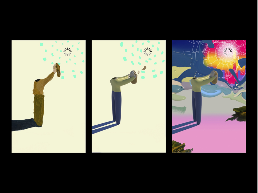
Returning to Pablo’s covers, the editor was most drawn to an image depicting a beheaded figure offering their head to a symbol—a sun or a loading search icon—but was curious to see it rendered in a more detailed aesthetic.
Pablo brought on illustrator Jon Han to create his version of the image. These illustrations, rendered digitally, had a unique pastiche quality with expressive daubs of paint juxtaposed against smoother digital textures.
Vauhini appreciated the originality of the images, but questioned whether they were right for her book.
The internetty imagery (the starburst icon; the figures resembling characters in early online role-playing games; the color scheme evoking the artificial rather than the natural) feel right for a certain kind of book about the internet, but not this book, which is so steeped in a critique of how Big Tech and its language—including its visual language—have colonized the way we communicate. I’m guessing Pablo has thoughtfully chosen these internetty-looking covers as a way to enact this colonization, like: Look, we’ve been so colonized that even this cover is a representation of the colonization! But, as with my argument about the AI-generated covers, I’m not sure people will have the right context to understand that this is what the cover is doing.
–Vauhini Vara
Meanwhile, a new editor was assigned to the book who was open to a new direction. Looking back at Pablo’s images, I realized that unless you were familiar with Prompt Brush, the images alone didn’t communicate technology. The “duet with AI” (in the publisher’s words) was missing.
A radically different approach was needed. Before assigning the book to Pablo, I had merely scanned the first pages of an early draft. I uploaded the latest manuscript onto my iPad and managed to read almost half in a single gulp. I was engrossed, like I was peeking at someone’s diary. It was so poignant and resonant. In particular, Vauhini’s adolescent anecdotes hurled me back to middle school, in 1998, when my friend Desirée and I spent an embarrassing number of lunch breaks attached to ethernet cables, discovering the wonders of the World Wide Web. The classroom was musty and dark, all blinds drawn down, as we frolicked around on Yahoo! Chat. Despite the book’s techy themes, there was a piercing humanity at the core of each essay.
I decided to talk to my husband Andrew, also a designer and a professor at Parsons School of Design, about the book, who picks up the story from here.
Andrew LeClair: In our work-from-home space, my wife Linda and I sit facing each other. Our monitors are placed back-to-back, and so although we can’t see each other’s screens, we overhear occasional conversations and sometimes talk about our respective design projects.
The book cover enacts what the book itself does—it pushes back against the “totalizing aesthetic of Big Tech” by resisting legibility at thumbnail size.
Linda told me about Searches. Looking at the images she had commissioned, I was drawn to Pablo’s all-type covers. The use of typography seemed to avoid the “totalizing Internet” aesthetic. Even the crude brushwork, although beautiful and striking, reminded me of the visual identity of Claude, a popular Large Language Model, demonstrating how thoroughly Big Tech has colonized visual language.
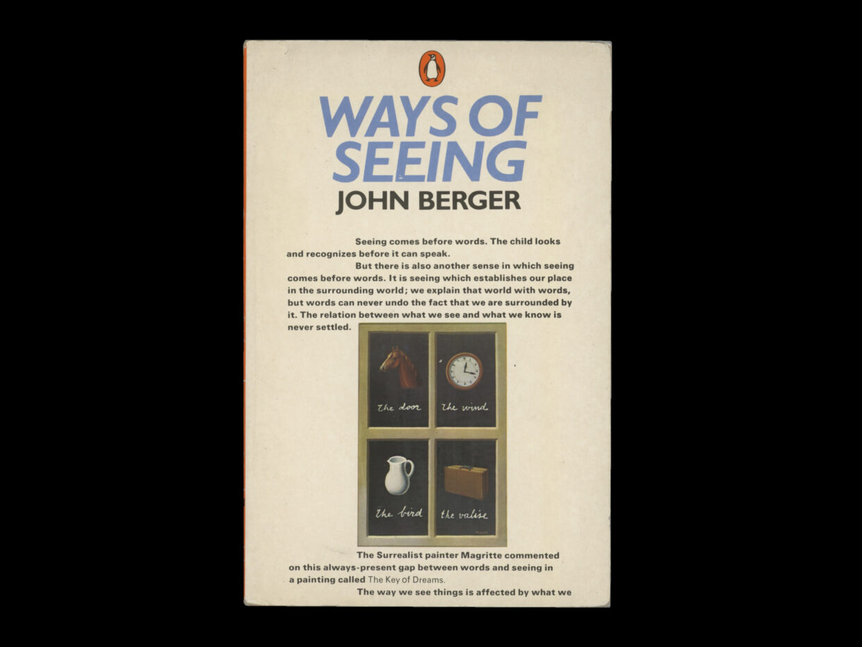
Linda shared an email from Vauhini with me, in which she describes 17th-century art as “an important antecedent to both art and a culture of extractive capitalism,” and this brought to mind John Berger’s Ways of Seeing.
Andrew LeClair: The cover of the iconic early editions marries text and image in a unique way—there is far more text than is typical, or usually allowed, on a book cover, and the image is placed as a figure in the text, rather than a design element. I’ve always appreciated this for the way it both solves the problem posed by a cover—how to give a prospective reader some sense of the content of the book—while also gently subverting the conventions of the genre. I was curious whether we could do something in this vein for Searches.
The central question remained: how does one communicate a sense of criticality? How does one give the reader a sense of the tension between the human and the machine in a way that evokes the contents of the book? I thought, perhaps the answer lies in those text-based directions; instead of using the machine to generate an image, we can use the machine to generate text.
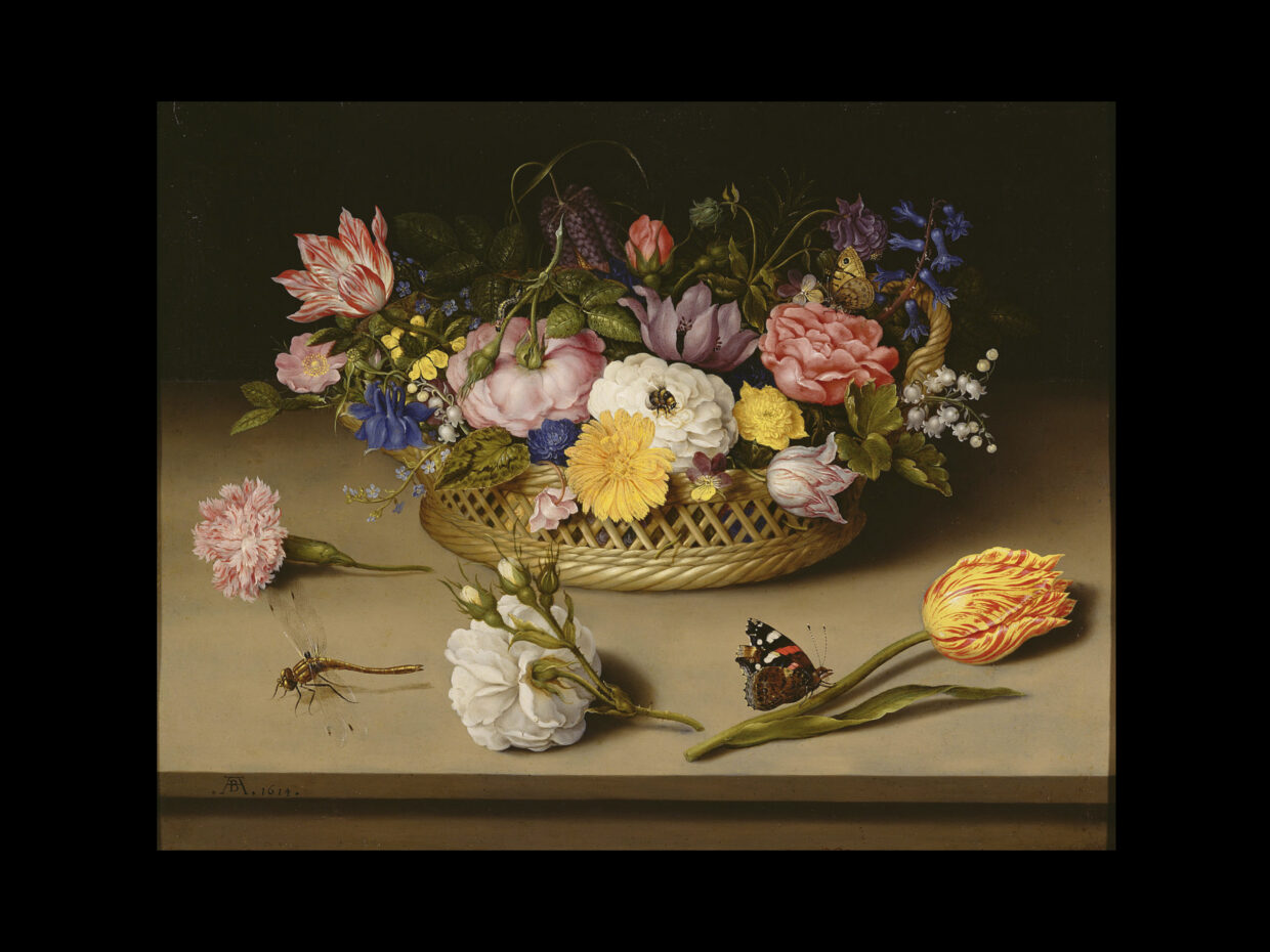
Excited to test out this idea, I passed the book’s title and an image of a random 17th-century Dutch painting from Wikipedia to ChatGPT and asked it to describe what it was seeing.
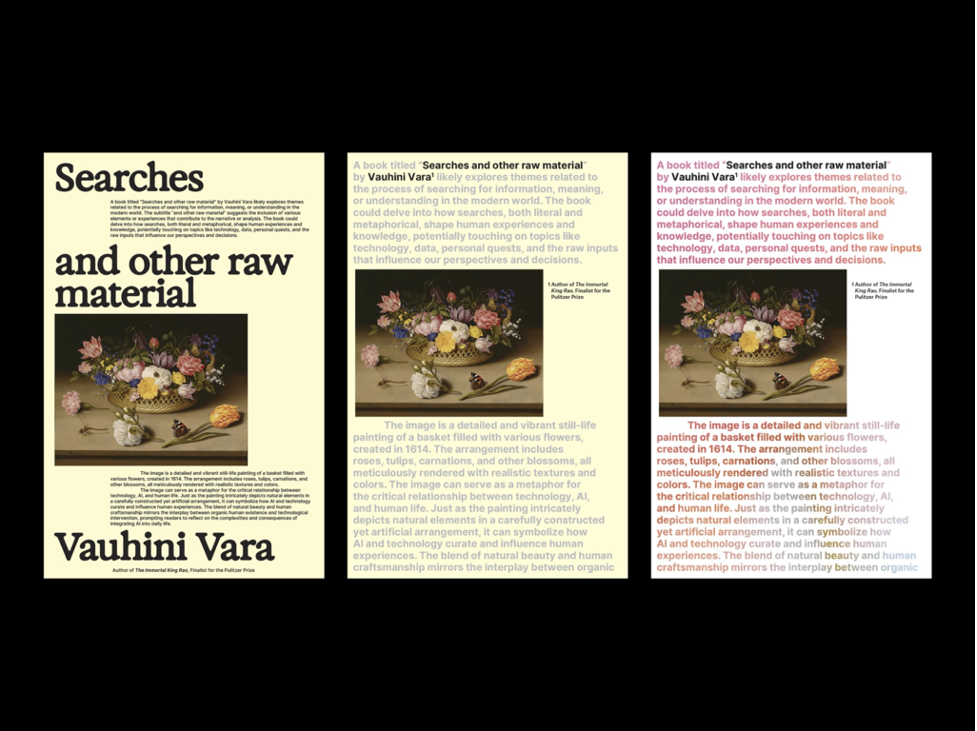
The image is a detailed and vibrant still-life painting of a basket filled with various flowers, created in 1614. The arrangement includes roses, tulips, carnations, and other blossoms, all meticulously rendered with realistic textures and colors. The basket is placed on a flat surface, and a few flowers are lying on the table next to it. A dragonfly and a butterfly add a touch of life to the scene.
–ChatGPT
Andrew LeClair: I asked, “Can you explain why this image would be appropriate for a book taking a critical approach to technology and people’s relationship to AI?”
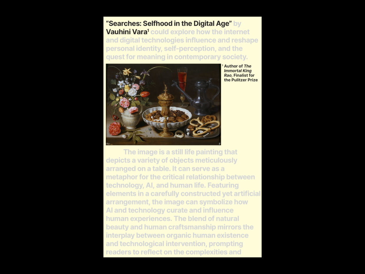
The image can serve as a metaphor for the critical relationship between technology, AI, and human life. Just as the painting intricately depicts natural elements in a carefully constructed yet artificial arrangement, it can symbolize how AI and technology curate and influence human experiences. The blend of natural beauty and human craftsmanship mirrors the interplay between organic human existence and technological intervention, prompting readers to reflect on the complexities and consequences of integrating AI into daily life.
–ChatGPT
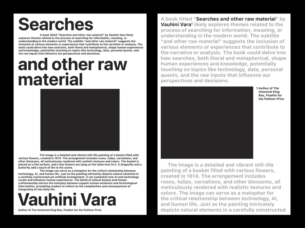
Andrew LeClair: Thinking back to the Berger cover, I made a series of quick compositional tests to pair the image and the text, and I passed these to Linda.
I shaped the raw sketches into viable covers, finding a balance between the book’s actual title and author with the secondary ChatGPT text. I added a pale yellow background and tried applying a multicolored gradient to the type. I thought they looked bonkers. I loved the texture of the wall of text, set at an atypical size, somewhere between a subtitle and a caption. We sent three of these compositions and the two typographic directions from Pablo to the author.
Vauhini wrote back with a “rapturous” response. She liked the ones with the painting in particular and asked us to swap another by Flemish artist Clara Peteers, featured in the manuscript.
It’s so original and provocative and smart, and it engages AI in a way that feels very much in line with the ideas of the book, where Big Tech is being critiqued through the use of its own tools. On a conceptual and philosophical level, I love the idea of having a human artist do the art, and then having AI analyze it (along with, it seems the title).
–Vauhini Vara
Andrew LeClair: She also edited the text to include a reference to John Berger.
When we lived in Madrid for a year, I loved to look at the four luscious paintings in a quiet, second-floor room in the Prado, by the Flemish artist Clara Peeters. The paintings are still lifes, showing tables extravagantly covered with luxury food and tableware. They remind me of Instagram; all four were painted in 1611, a time when the Flemish merchant class was acquiring new luxuries from all over the world and appreciated art that could document them. “Here, the edible is made visible,” John Berger writes, in Ways of Seeing, of a different still life from that era. “Such a painting is a demonstration of more than the virtuosity of the artist. It confirms the owner’s wealth and habitual style of living.”
–Vauhini Vara
As the cover moved through various stages of approval, we thought about how it would live in the world, how it would be legible at a thumbnail size. As Vauhini argued to her agent, the book cover enacts what the book itself does—it pushes back against the “totalizing aesthetic of Big Tech” by resisting legibility at thumbnail size.
I made the secondary type larger and lighter so the black type would be clearer, and the copy generated by ChatGPT was edited to be more concise. The subtitle also changed. The final cover stands fairly close to our original iteration.
The cover design process begins with text—the cover brief and the manuscript—which a designer translates into an image, the final cover. Can an AI model replace this process? No, because a true design process is an orchestration of a much more complex, iterative process of prompting—from text to image, from human to human, from human to machine, and from the machine back to the human—each mode informing another, grounded in a deep understanding of the design’s intention. Our jobs are safe, for now.
__________________________________
Searches: Selfhood in the Digital Age by Vauhini Vara will be published by Pantheon Books in April 2025.

